Tuesday, March 17, 2009

Funny/Maze Lock - guarantees you'll perish in a fire


"Is escaping your home in case of an emergency too easy? Need more of a challenge escaping during a fire? How about adding the Defendius Door Chain from Art Lebedev (maker of the Optimus Maximus). As you can see it's a maze. A maze of death. By fire. No word on price or if the damn thing is even real, but if you really want a challenge trying to get out of the house I'm your man. For $30 I'll stand in the doorway attacking you with a can of mace and taser while you try to get by. Slip me an extra fiver and I'll even bat you in the nuts a few times."

HA HA, this just make me laugh out of control when i saw it! ha ha~

"UPDATE: Turns out it was a hilarious April Fools joke! AHAHAHAHHA. So funny. *wipes tear* Thanks a lot Jack, you dick." the blogger said.

*from:
http://www.geekologie.com/2008/04/maze_lock_guarantees_youll_per.ph


Sunday, March 15, 2009

Package/Milk Concept


“This was a personal experiment in form, function, and fun. The goal of this redesign was to use a standard milk carton as the canvas to create a clean, modern, and functional design yet still approachable for the average consumer.”

Onda: this package was designed by David Fung. Nice graphics, i love this style! But i do know it's look strange if these packages are really release to market! :) but i still love it, ><

Video/Flickermood 2.0 - Sebastian Lange


Onda: Love this motion and flow of this video, i hope i can learn how to make one too, can i?

AD/School of Visual Arts


Advertising Agency: KNARF, New York, USA
Creative Director: Frank Anselmo
Art Directors: Jeseok Yi, Frank Anselmo
Copywriters: Frank Anselmo, Jeseok Yi
Photographer: Billy Siegrist

"CREATIVE THINKERS SUCH AS STEFAN SAGMEISTER, PAULA SCHER AND MILTON GLASER TEACH CLASSES AT THE SCHOOL OF VISUAL ARTS. THIS CAMPAIGN REFLECTS THAT TRADITION BY ENCOURAGING PEOPLE EVERYWHERE TO 'THINK' WHILE ALSO GIVING THEM A PLACE TO WRITE DOWN THEIR THOUGHTS."

Onda: Nice stuff! I love the sugar pack! I agree that "giving them a place to write down their thoughts.", just like why we need to have a visual diary. Or may be i just like the form or tone of this style. :)

AD/Loctite Super Attak: Plastic, Wood, Porcelain


"Welcome Back"

Advertising Agency: DDB, Milan, Italy
Eexecutive Creative Director: Vicky Gitto
Art Director: Ricard Valero
Copywriter: Alessandro Mian
Photographer: Andrea Melcangi
Post Production:The Scope, Hamburg

Onda: Wow, nice pictures. These are the print ad of Loctite Super Attak. I remember this topic have been discussed during class. In this set of print ad, using the warm feeling to be the theme, like they can make the robot doll back with using their product, really back, memories too. This is an example of connotation? or what if? love this set of print ad's concept. :)

Horror Movie/THE BLOD

Onda: OH MY GOD! I just cannot believe it! I found this movie poster, this is one of  the horror movies i watched when i was little, really young!! i think i was 5-6 years old only when i watched this film. And this is the 1988 version, there is a older version, made in 1958! But i watched the 1988's one.

I don't know why my parent would let me watch this kind of movie, as when i watched some clip from this movie now, i'm really scared! So terrible><>

If you want to know more about what i m talking about, check this:
http://www.youtube.com/watch?v=_AASYGG7mrw&feature=related

But, beware of this scary scene, really!


***and one more thing, if u are same as me, have seen this movie before, please drop me a comment, :) i do want to find someone who like me, has watched this when they were little!

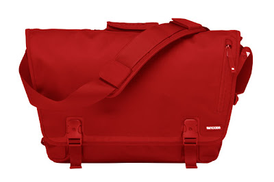
Red/Help me please ;)


Onda: how can these products "come into" my eyes? It's hurt me!! i want it so badly! Damn it! :)

These are the products from "incase", they have many nice design for mac, like the shell of macbook, macbook pro, iphone, ipod......they all look stunning, help>< gorgeous! 

*more lovely products here:
http://goincase.com/


Saturday, March 14, 2009

Video/Arkitip interviews Kyle Blue


“Kyle Blue discusses his work as the Design Director of Dwell Magazine, how lessons learned about living and working in modern spaces have influenced the organization of the Dwell offices, and what it takes to have a thriving magazine in the current publishing industry. Kyle is also a reporter for the Arkitip Intel.”

Onda: I have thought about to work in magazine studio before, may be i can say, that's my dream(before). Just feeling great for found out this video, a dream place(i mean the studio), a dream mood(seem only><), a dream work(really?) and working with passion in my life. But, in Hong Kong, or just onda, may not fit for working yet ><

After watching this video, wow, that's not a dream! but it's still far away from onda. may be a monthly magazine will be better for me(as my slow 'work speed'), or i just change my mind to having my dream studio(must have a corner, no, a wall in red!) and 'dream' projects(that's means i can do what ever i want, but i don't know how to write that idea out) ?

hope you will enjoy this video :)

Thursday, March 12, 2009

Week_07/Fighting for my life!


Onda: just found this sweetie words, wondering if it was written by woman or man, haha~ :)


*To onda: after the presentation on 10/03, u will not be the same, right? u must strive for my life and my family, huh, onda?


Saturday, March 7, 2009

Research#09/Type of tissue

Tissue can normally be divided into:

01 box facial tissue

02 soft pack tissue

03 kitchen towel

04 mini handkerchief

05 M-fold series toilet paper

and these are commonly product type find in Hong Kong market.

Thursday, March 5, 2009

Red/ Oh my GoD! Is this for me?! My Dream Product Collection#05:Canon IXUS 100 IS

Onda: I just cannot believe that such design will appear in this world! So lovely!!!


Can you see? It is TOTALLY RED! (in fact, in the front face only''') This is one of the latest products release by Canon in 2009. In this collection, there are totally four color: black, sliver, gold and red. Apart from the red one, the black one is also attractive! :)


And the TVC of this collection is also look nice. In fact, I didn't own a camera before, (i just have one-sony which was given by my relatives, but it has gone for a while ><) so, i feel a little bit sad that i have missed many lovely and valuable scene in my life as i love to use image to keep memories. (common sense, huh?) In 08 summer, i have plan to buy one, and have chosen which model i want and fit my needs already, but because of it's a bit expensive, the idea has gone. I still looking for a better one(cheaper ><) and hope i can hold it on my hand ASAP ><         :)

Wednesday, March 4, 2009

AD/Scottex Toilet paper

We will have our first presentation in next week, hope we can well prepare for that!
Good Luck :)


"Extra long. Extra strong."
Agency: Duval Guillaume, Antwerp

Onda: O! Can you tell this is a tissue advertisement?! Ha ha, but is good to see such 'strange' tissue ad.(forgive me to use "strange" to describe this ad ><) Combine with it's description, I do think many people will thing of something else but not tissue, ha ha :) "As...as" case?

AD/Sensodyne: Teeth


Advertising Agency: REP/GREY Worldwide, Bogota, Colombia
Creative Director: Mauricio Duenas
Creative VP: Juan Pablo Hernandez
Art Director/Photographer: Juan Carlos Fandino
Copywrite: Leon Corkidi
Account Director: Beatriz Eugenia Garzon
Account Exective: Carolina Melendez de Zubiria

Onda: WOW! I can't stop laughing when i saw these three print ads! Today, Vincie told us the role of copywriter, and some skills in presentation stage. Funny lecture :) And just cannot believe that i can found these example to be study case :) I do want to upload the lecture note here today, but i need to working on my FINAL project, so...

As you can see in these three posters, the teeth 'said' what they 'feel' to their owner, that means you(or the target audience), i love this part, really lovely! :) and these are also are great example of what a copywriter need to do in the ad. 

The first teeth feel angry and annoying of being used, said, "Face it! You only want me because I always have your food ready. I'm sick of being used!" This is an example of denotation that the people just see their teeth as 'tool', but do not really care how to protect or keep healthy of the teeth. They are selling the product can protect or make your teeth more healthier.

The second one, "We've come so far together, but you now want to throw everything out the window. Your coldness hurts me. Don't you feel my pain?" Is this sympathy?(this made me think of robert's laugh face :P ) This showed that the people ignore their teeth(or the pain of teeth) that just do not think it's a matter. onda:"poor teeth, don't said like that la~ ><"

The third one, the image or character is very strong. "So now you're sorry, huh?" Well, it's too late. I only hope my pain is your pain." The message is very clear in this one, and telling the factual situation to the audience. Are three of these print ads are in serious? Seem not,huh? I cannot control laughing when i saw this one!(in fact, i saw this one first, and found out the whole set of ads :P ) Have you ever imagine you teeth say something like that to you? Ha ha ha~ Really lovely~Thanks for the design team of this set of ad, it make me smile and i do think i will buy this brand for my sensitive teeth! :)

But don't you remember, this brand also have their product sold in Hong Kong, and just like Vincie said today, the ad style of this brand in Hong Kong is something like presenting the factual data to the target, said the dentist also using their product or prove the function is real of their product. So, i want to say is the above print ads(this post), may not useful or fit for hong kong market? But some similar case (the campaign of the sending the message 'love your teeth' organization) have use such tone to present their concept too, but not visually similar. Personally, i do think this kind of ad will be okay for hong kong market too, but may not fit for the product image....what am i saying? ><

AD/Pepsi Max: Lonely Caloie


Advertising Agency: BBDO Dusseldorf GmbH, Germany
Creative Director: Toygar Bazarkaya
Art Director: Michael Pluckhan
Copywriter: Kenny Blumenschein
Illustrator: Johan Potma

Onda: Have you seen any ad or illustration like this? By presenting how this poor blue thing kill itself!? But please check that this is the ads for PEPSI MAX!! They using SYMPATHY? ha ha... :)

Tuesday, March 3, 2009

Logo/! OBAMA logo design

Onda: It was really amazing that I found these two videos which talk about how the creative development design the Obama '08 campaign logo! Logo design always a hard item for onda within a rebranding project. And these videos told a really nice example (i mean for student reference only, the design is not included in this stage!) of the process of designing a logo.(i think the image of the whole campaign too!) Love the tone of the speaker (may be coz he is a professional''') and the whole news. :) make sure you will take a good look of these, as it is really useful for us, enjoy :)  !

"Sol Sender, who led the creative development of the Obama ’08 campaign logo, has joined VSA Partners as a strategist. As principal of the design agency Sender LLC, Sender developed the design strategy and directed a team of designers that created the defining symbol of the 2008 campaign.

The Obama ’08 assignment began in late 2006, when Sender’s firm was hired by MODE, a Chicago-based motion design studio with an existing relationship with David Axelrod, the Obama campaign’s chief strategist.

Given two weeks to develop design options, Sender and two designers—Andy Keene and Amanda Gentry—produced multiple logos for consideration by the campaign, including a version of the now-famous “O” mark—a landscape in which of blue and red are united within the candidate’s last-name initial. The team’s refined Obama ‘08 logo made its official debut on February 10, 2007, when (then) Senator Barack Obama announced his candidacy for president in Springfield, Il.

In the video below, Sender tells the story of conception and birth of the Obama ’08 logo, including the strategy behind it, developmental concepts and finalist designs for the identity not chosen by the campaign."


* love this statement: 
"The strongest logo tells simple story."

:) agree?

AD/Zoologischer Garten Berlin: ZooCard


Advertising Agency: Scholz & Friends, Berlin, Germany
Creative Directors: Matthias Rebmann
Photographer: Matthias Koslik
Graphic Artist: Katharina Hanel
Account Managers: Eva Lipp, Bjoern Kraemer

Onda: Love this ad! It has used denotation to make the audience think this may one of the reasons that why you need the annual pass of their zoo. Or we can say this is one of the advantages that you can come in anytime if you want(they show the example in the ad) if you have a annual ticket. quite good concept, huh?  :)

Monday, March 2, 2009

AD/New York Film Academy


"Want to write something good for the cinema?"

Advertising Agency: Red Cell, Milan, Italy
Creative Directors: Roberto Vella, Stefano Longoni
Art Director: Paola Bussa
Copywrite: Simona Laudisa
Photographer: Mauro Turatti

Onda: I found using PUN in at is really lovely :) This ad mixed up of popcorn & trash bin by their shapes and color outlook, love it. what do u think?  :) love this mood and tone appear in this ad. :) and this make me think of Robert said that it is really hard to made a nice crumpled paper, there are MANY crumpled papers in this ad, can you guest how long has this shot take?  ha ha :)

AD/Essilor Lect up lenses


Advertising Agency: Callegari Berville Grey. Paris, France
Exective Creative Director: Andrea Stillacci
Creative Director: Jerome Gonfond
Art Director: Jerome Gonfond
Copywriter: Yannick Savioz
Photographer: Ilario & Magali
Illustrator: La souris sur le gateau
Art Buyer: Elena Mazzanti

Onda: love this funny ads with using exaggeration to promote the function of its product. :)

AD/Sony EX Headphones


"Perfect sound Sony EX Headphones."

Advertising Agency: Saatchi & Saatchi, Sydney, Australia
Creative Director: Steve Back
Art Director: Nic Buckingham
Copywriter: Paul Bootlis
Photographer: Chris Mollison

Onda: Sony ad for its new headphones collection, not selling the product design, not selling the lifestyle image, but the function of headphone. By using PUN to present the concept of the great quality of sony EX headphone, like the clean & clear message in the poster.  :)

AD/Tabasco


Advertising Agency: Glucose, Karachi, Pakistan
Creatives: Ali Mumtaz, Sakib Afridi
Photographer: Philip Habib

Onda: Tabasco's advertising always has its style: promoting its product is HOT. In these ad, phone, harmonica and megaphone are used in presenting the concept of tabasco is really hot.
Love it use 'as...as' to show the aftermath of eating with tabasco pepper sauce. But I do think the visual in these ad can be better :)